Key Takeaways
This project taught me that good visual design at scale is less about creating individual pieces of content and more about building a system that allows many different pieces to work together.
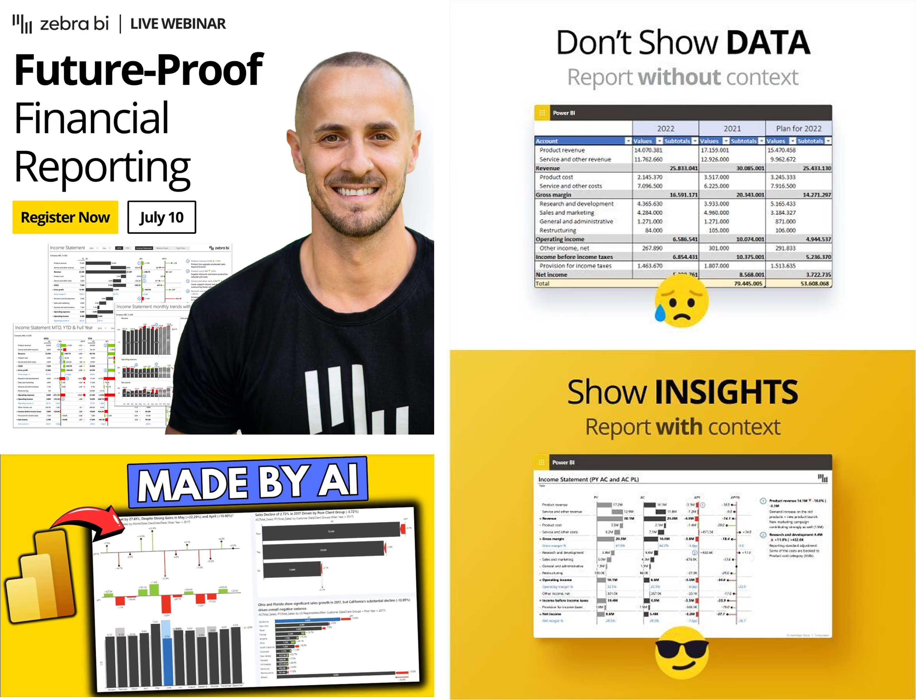
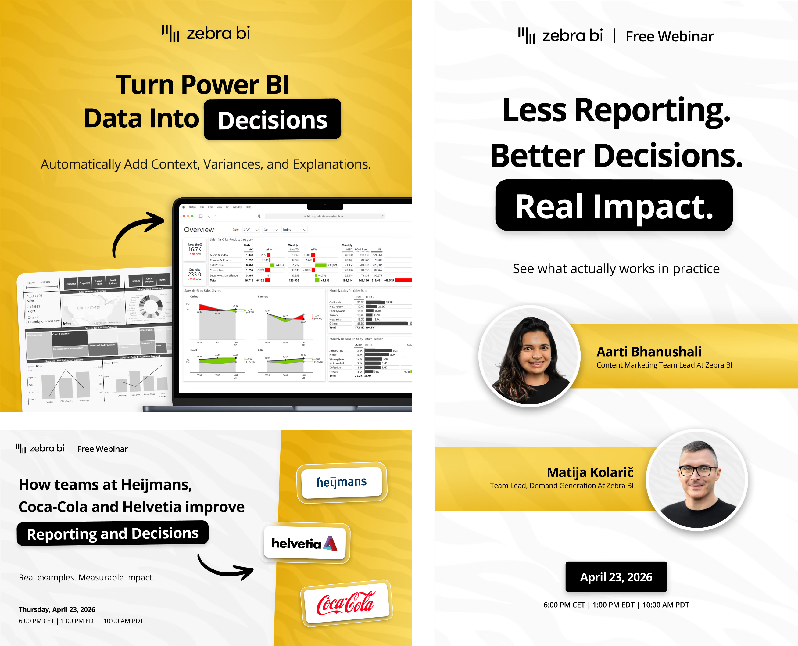
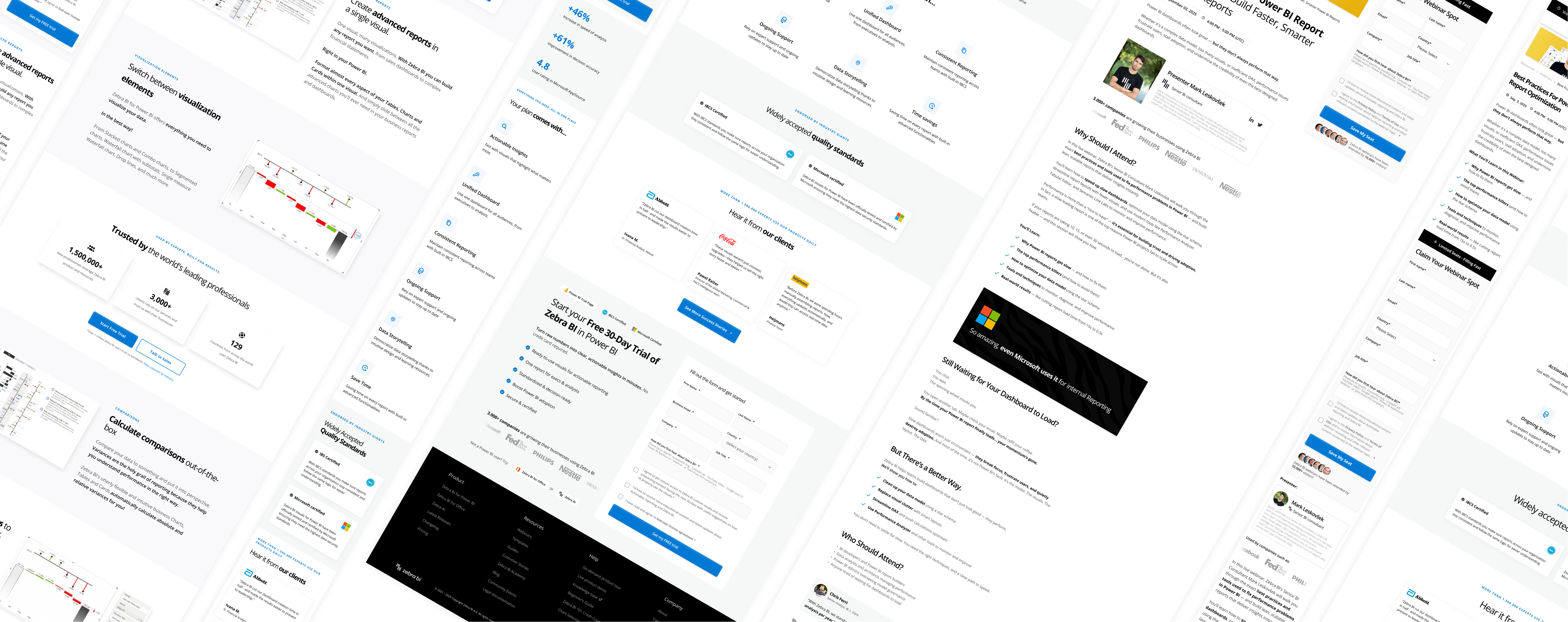
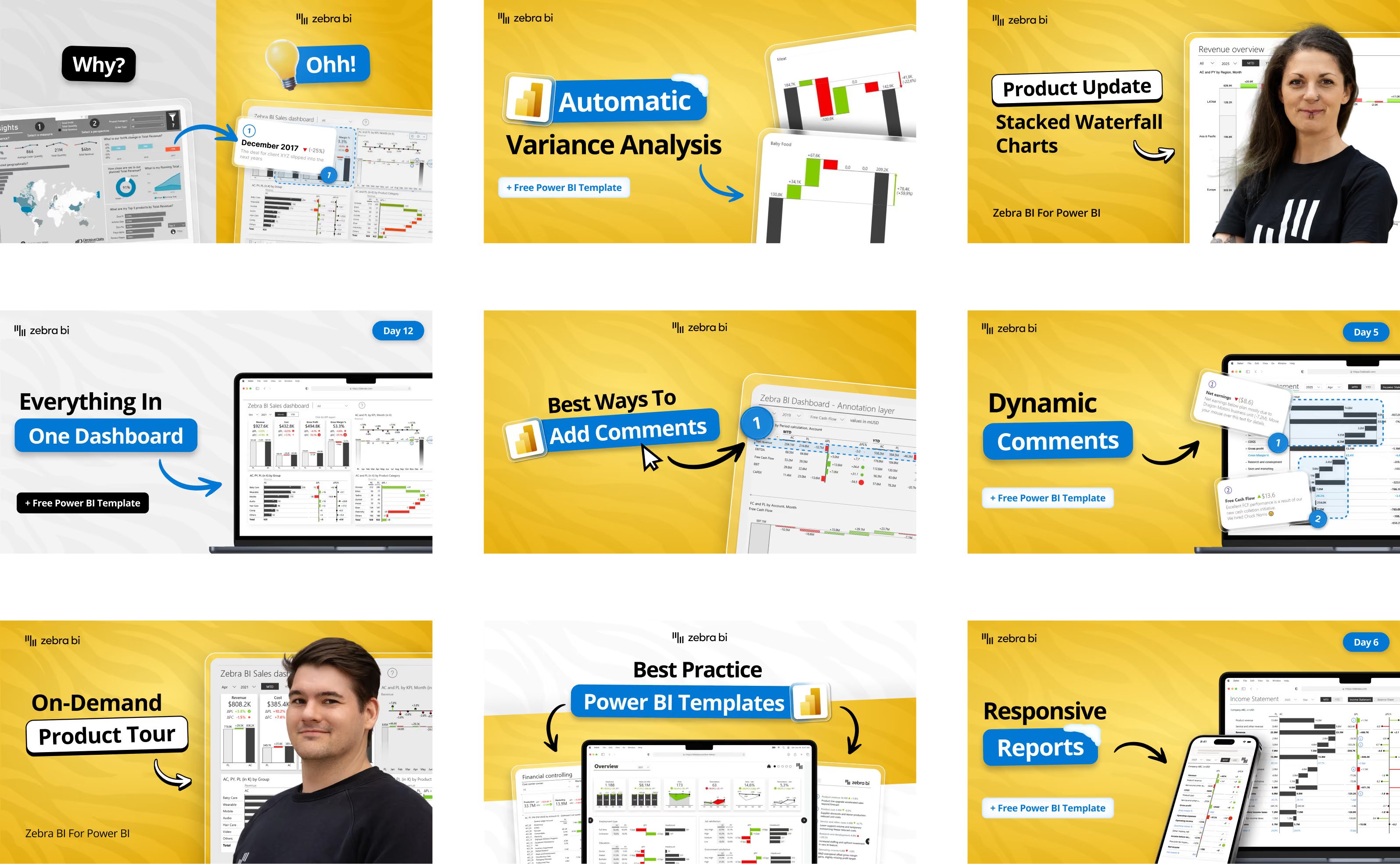
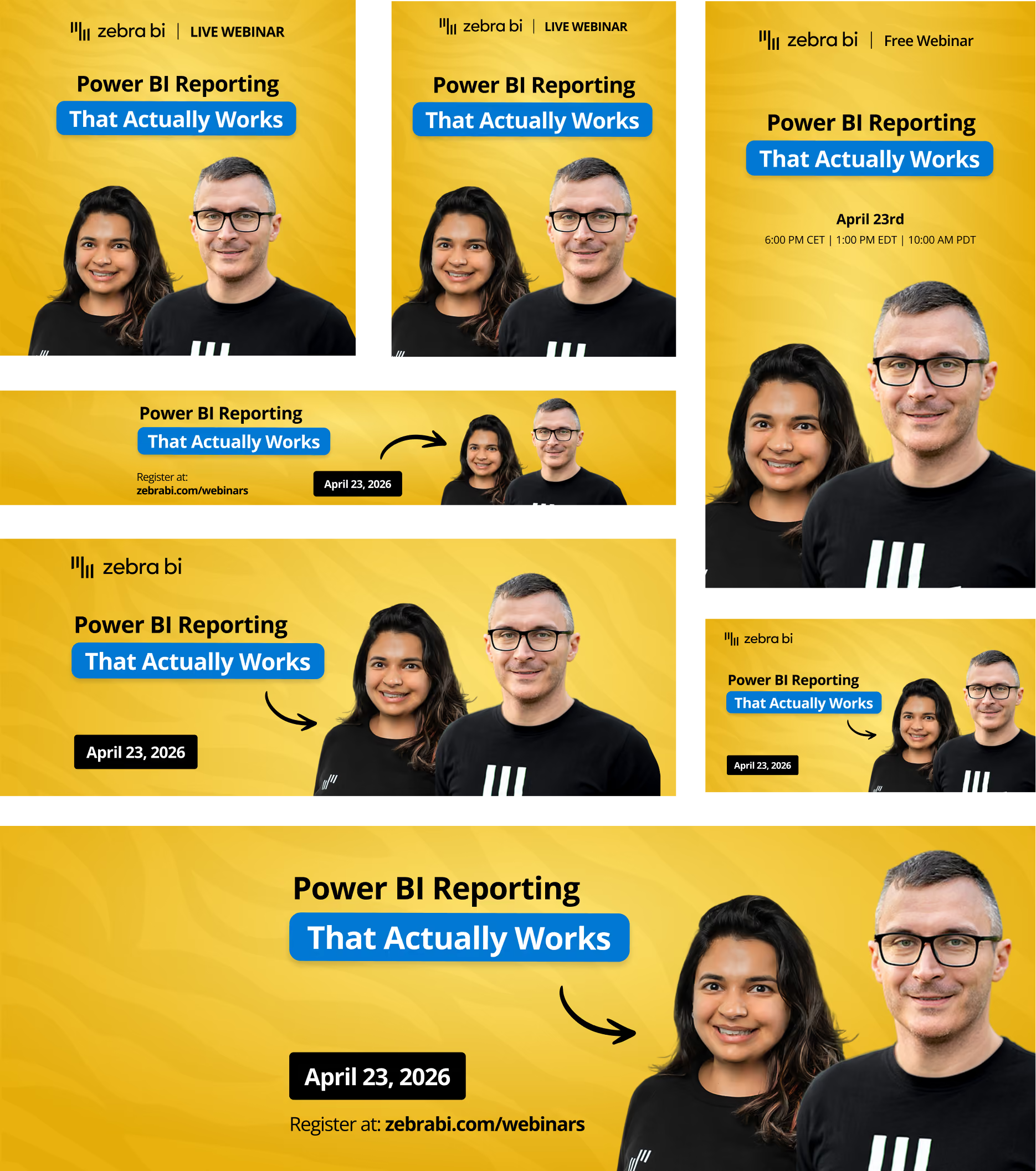
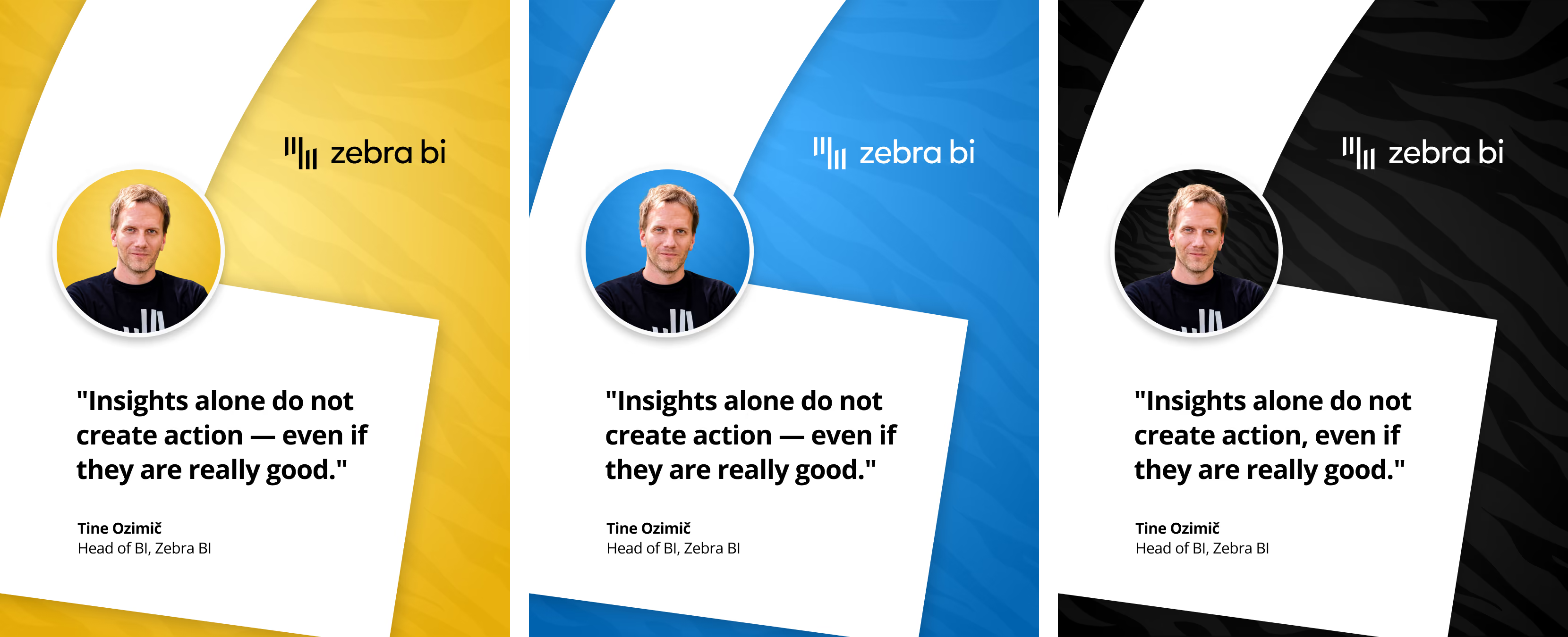
Working across 320+ assets meant constantly balancing consistency with flexibility. A YouTube thumbnail, landing page, paid advertisement, and social media post all have completely different purposes, but they still need to feel like they belong to the same brand.
One of the biggest challenges was learning when to follow the established visual language and when to break away from it. Reusable layouts and design principles created consistency, but each asset still needed to communicate its specific message effectively.
The project also pushed me to think beyond aesthetics. For advertising especially, design decisions had to support performance — from how quickly a headline could be understood to how the composition competed for attention in a busy social feed.
Most importantly, the project expanded my role beyond traditional UI/UX work. I learned how visual systems, marketing design, product communication, and performance can work together to create a more cohesive digital experience.
It gave me experience designing not just individual screens or assets, but a scalable visual ecosystem that could support a growing brand across multiple channels.