UI/UX Design

Conversion Design Website

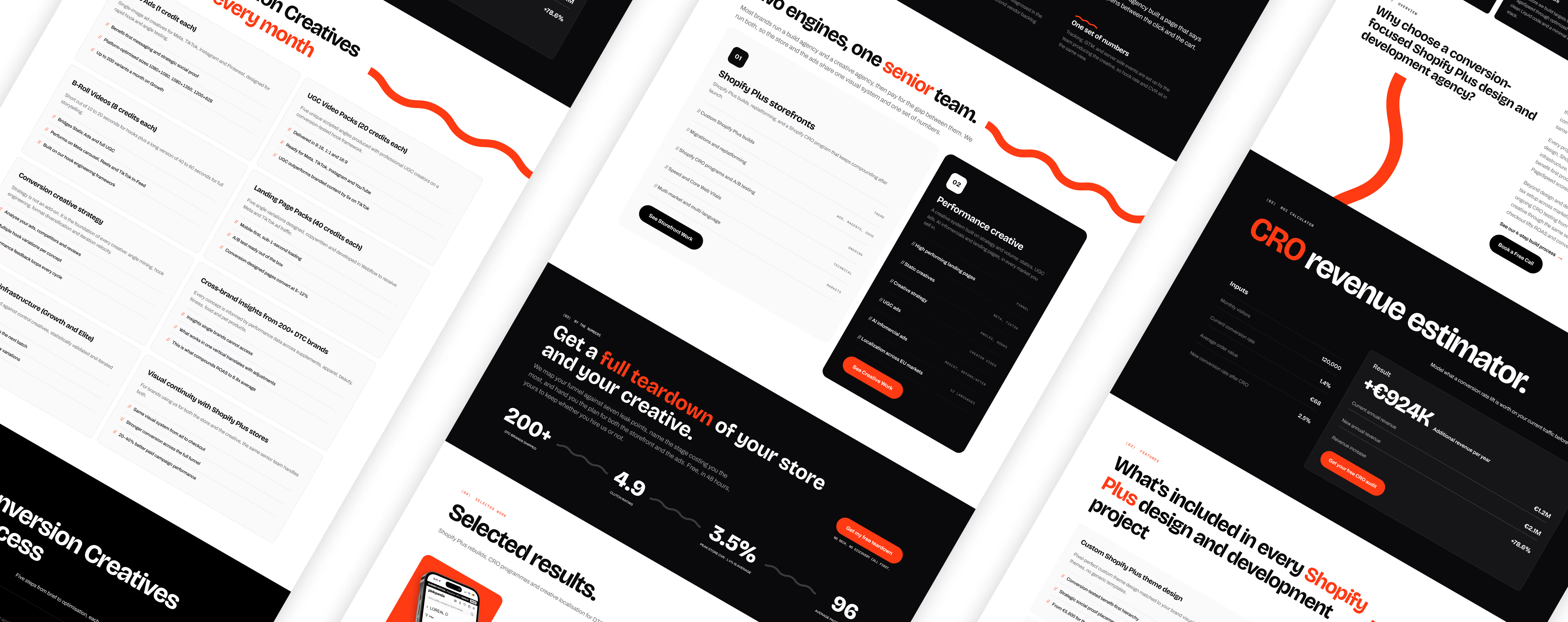
Redesigning a performance-driven agency around a sharper, more confident digital identity.
Company Website
Figma
Made in 8 hours
The challenge

Making two sides of the business feel like one

Conversion Design combines Shopify Plus development with performance creative two services with very different audiences, deliverables and ways of communicating value.

The goal of the redesign was to create a website that could communicate this breadth without feeling fragmented.

I wanted the new experience to feel more confident, editorial and commercially focused, while giving the agency a distinct visual identity that could carry across its entire digital presence.

The website needed to do more than explain what Conversion Design does. It needed to position the agency, demonstrate its expertise and guide potential clients toward taking action.
Website Logic

The Guided Website Flow

I structured the website around the questions a potential client needs answered before deciding to work with the agency.
The positioning

What is Conversion Design?

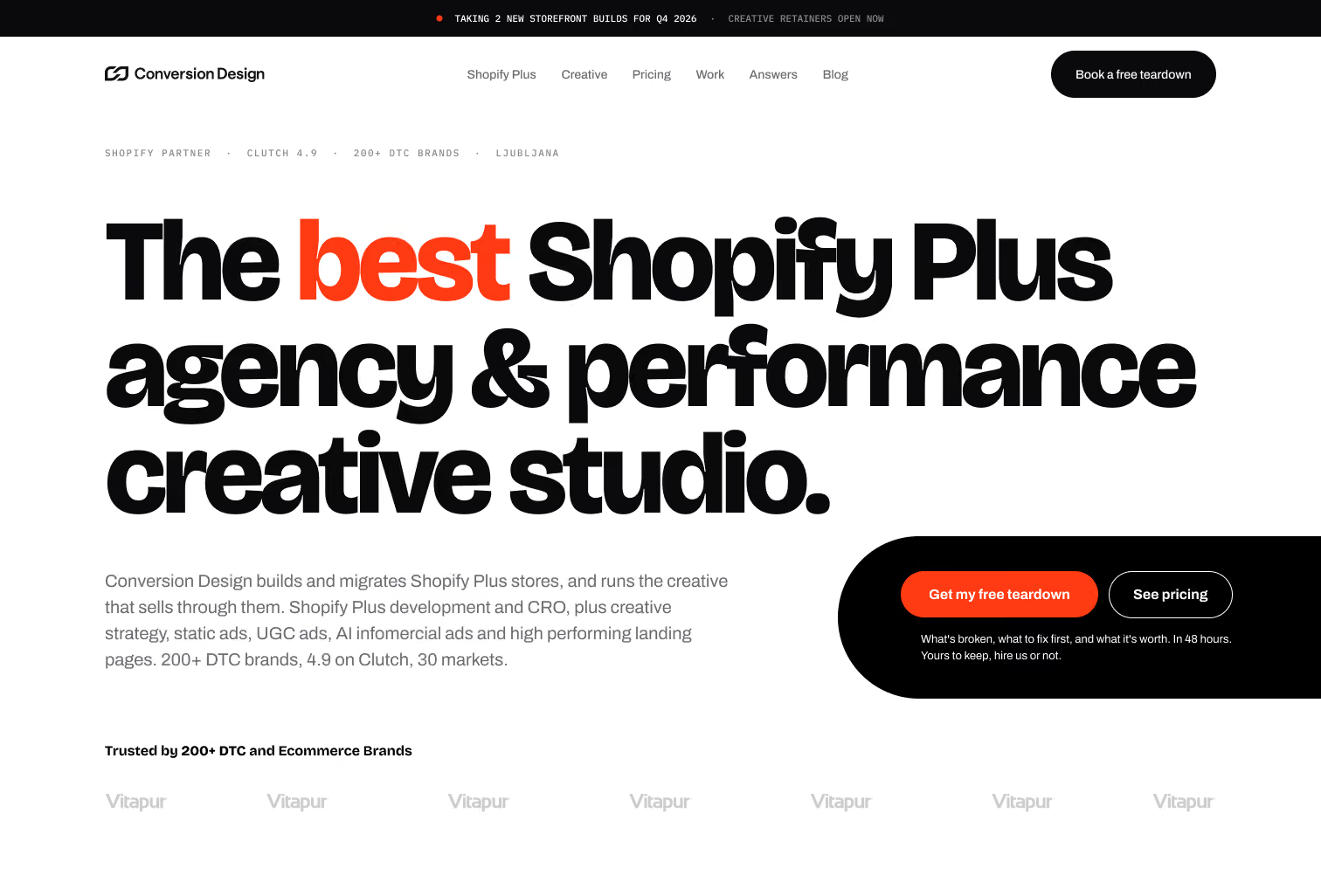
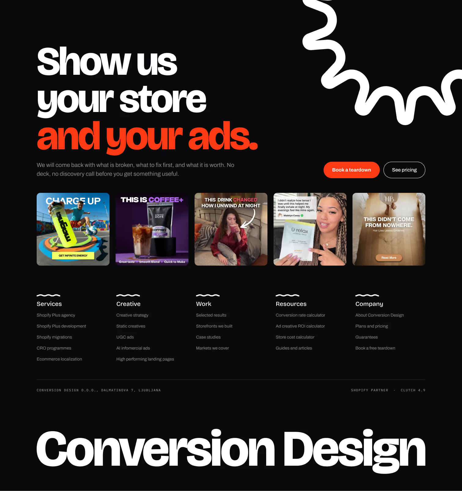
The hero was designed to communicate the agency's positioning within the first few seconds. A strong typographic hierarchy, restrained use of the orange accent and prominent CTAs create a clear entry point while establishing a confident, premium visual direction.
Problem Statement

Why do I need your services?

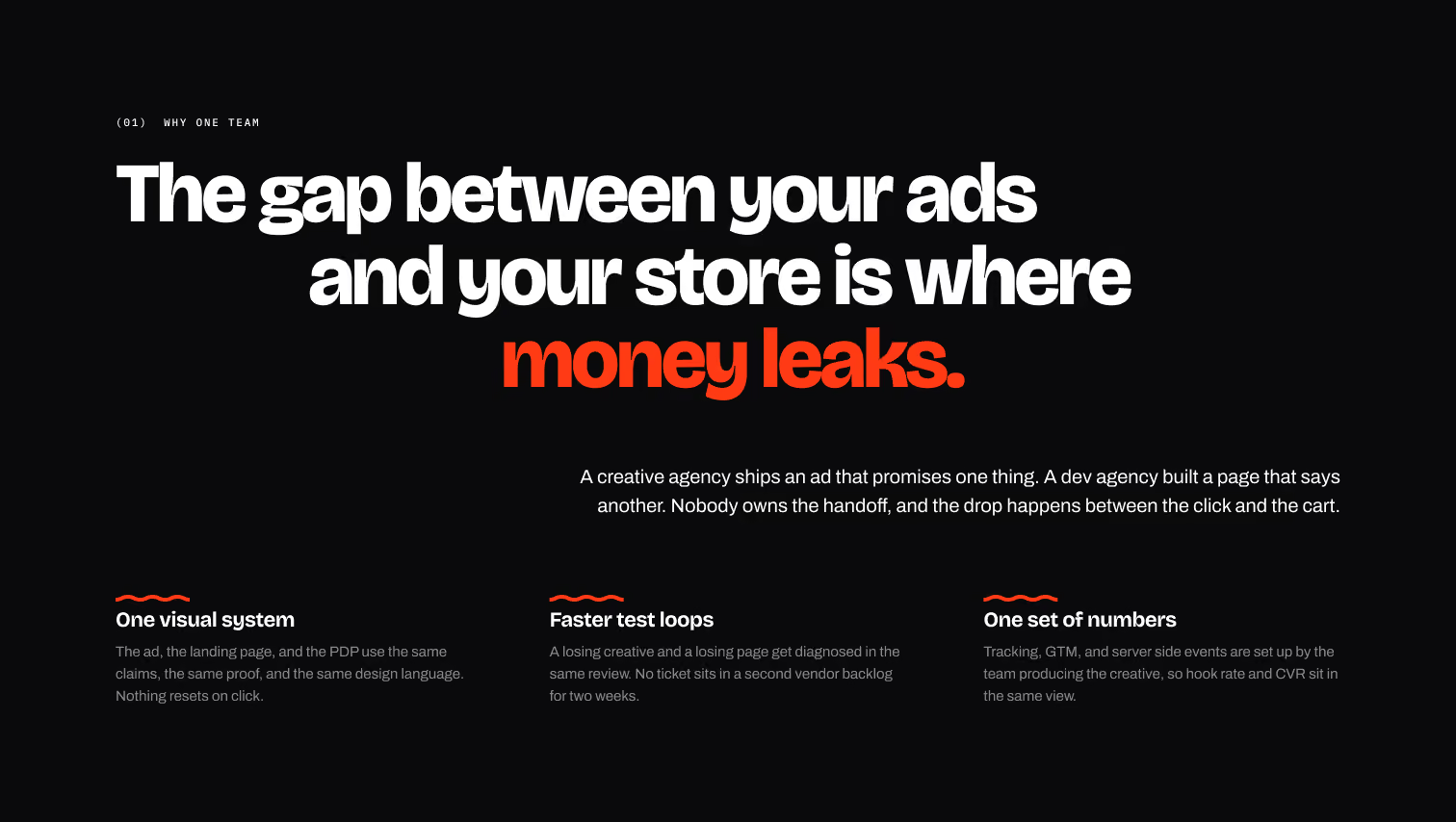
Rather than introducing services immediately, the experience first establishes the gap between advertising and ecommerce performance. The high-contrast section creates a visual break while framing the agency's offering around a clear business problem.
Services

What do you offer?

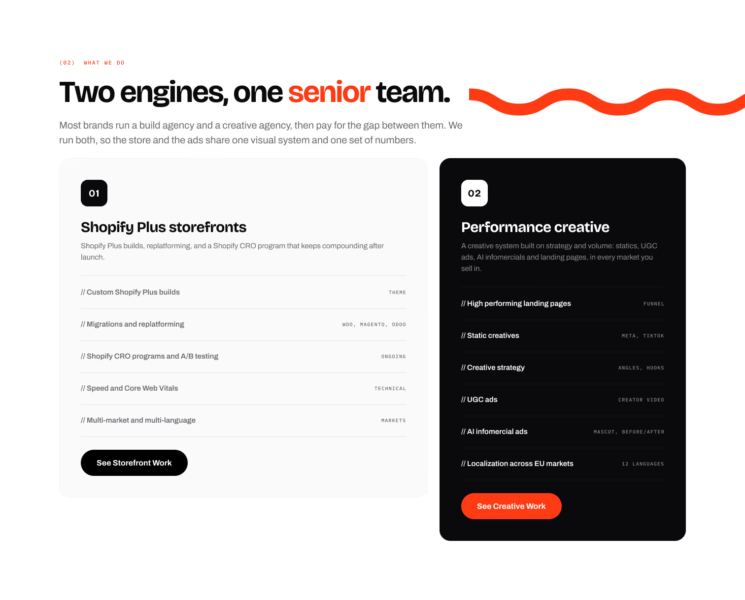
The core services are presented as two distinct but complementary offerings. A shared component structure maintains consistency, while the contrasting card treatments create enough differentiation to help users understand the two areas at a glance.
Building trust

Why should I choose you?

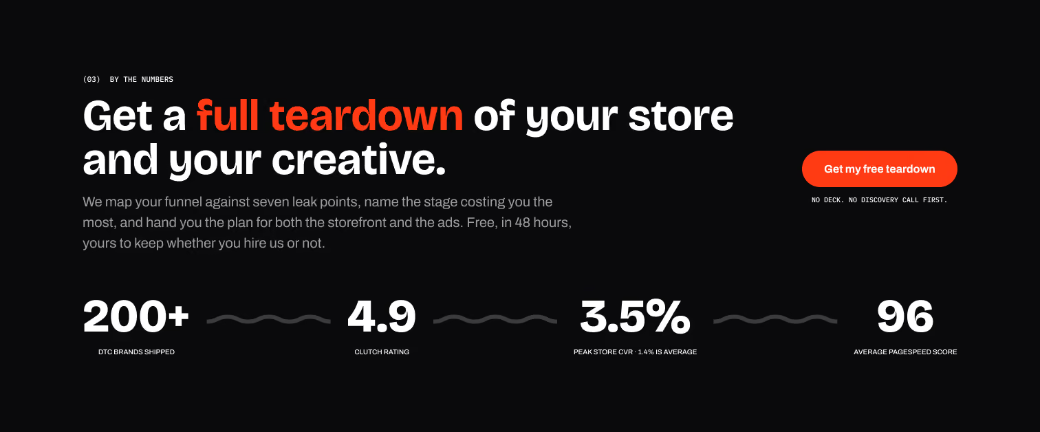
A compact set of key metrics provides immediate validation before introducing detailed project results. The large-scale typography gives the numbers visual priority while keeping the surrounding information minimal and highly scannable.
Selected works

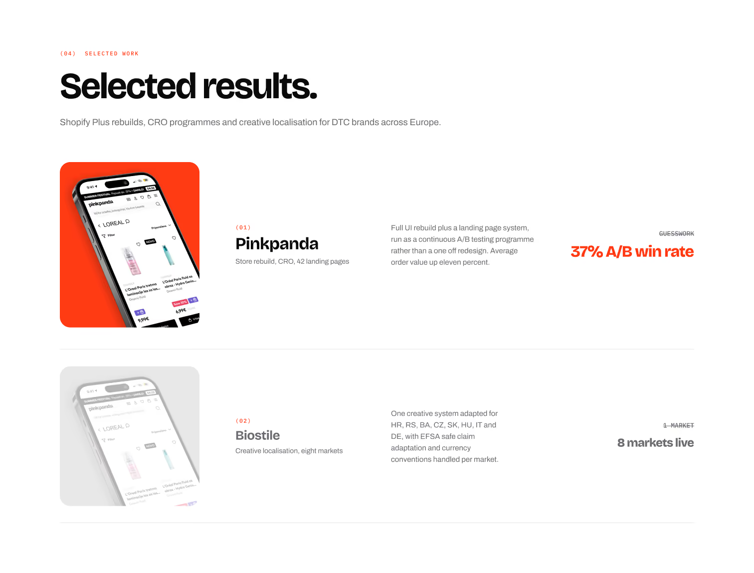
Do you have any proof?

The selected work section connects each project to a specific outcome rather than presenting the work purely as a visual portfolio. The editorial layout creates a clear relationship between the client, project scope and measurable result.
Creative Service Breakdown

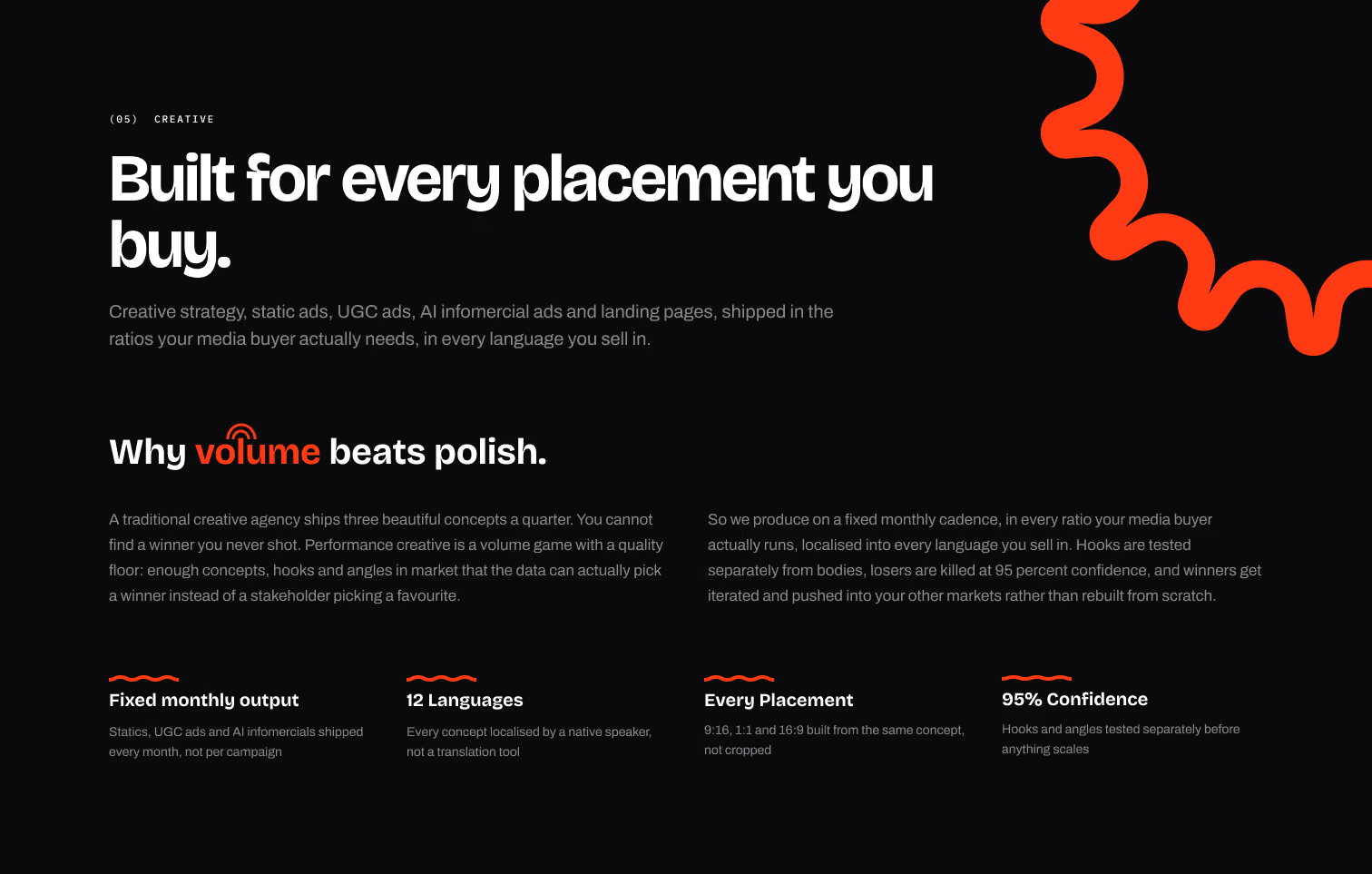
What do I get?

The creative section expands the proposition by demonstrating the breadth of formats, placements and markets supported by the team. Supporting metrics reinforce the positioning around scalable, performance-driven creative rather than isolated campaign work.
Shopify Breakdown

How does the shopify Process look like?

The engagement is broken into four clearly defined stages: Teardown, Build, Test and Scale. A consistent layout, progressive numbering and custom illustrations make the process easy to scan while communicating a systematic approach to delivery.
Testimonials

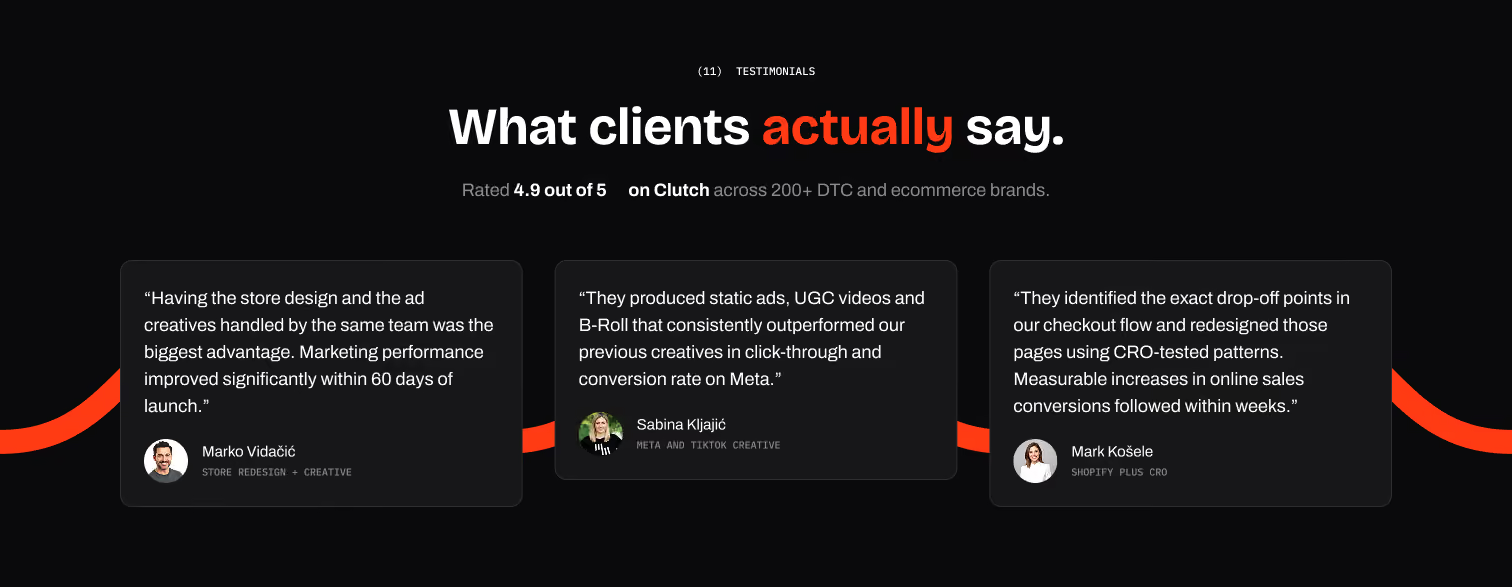
What do other say about the business?

Testimonials are positioned after the visitor has already been introduced to the services, work and methodology. This allows social proof to validate the claims that have already been established rather than functioning as an isolated testimonial block.
FAQ

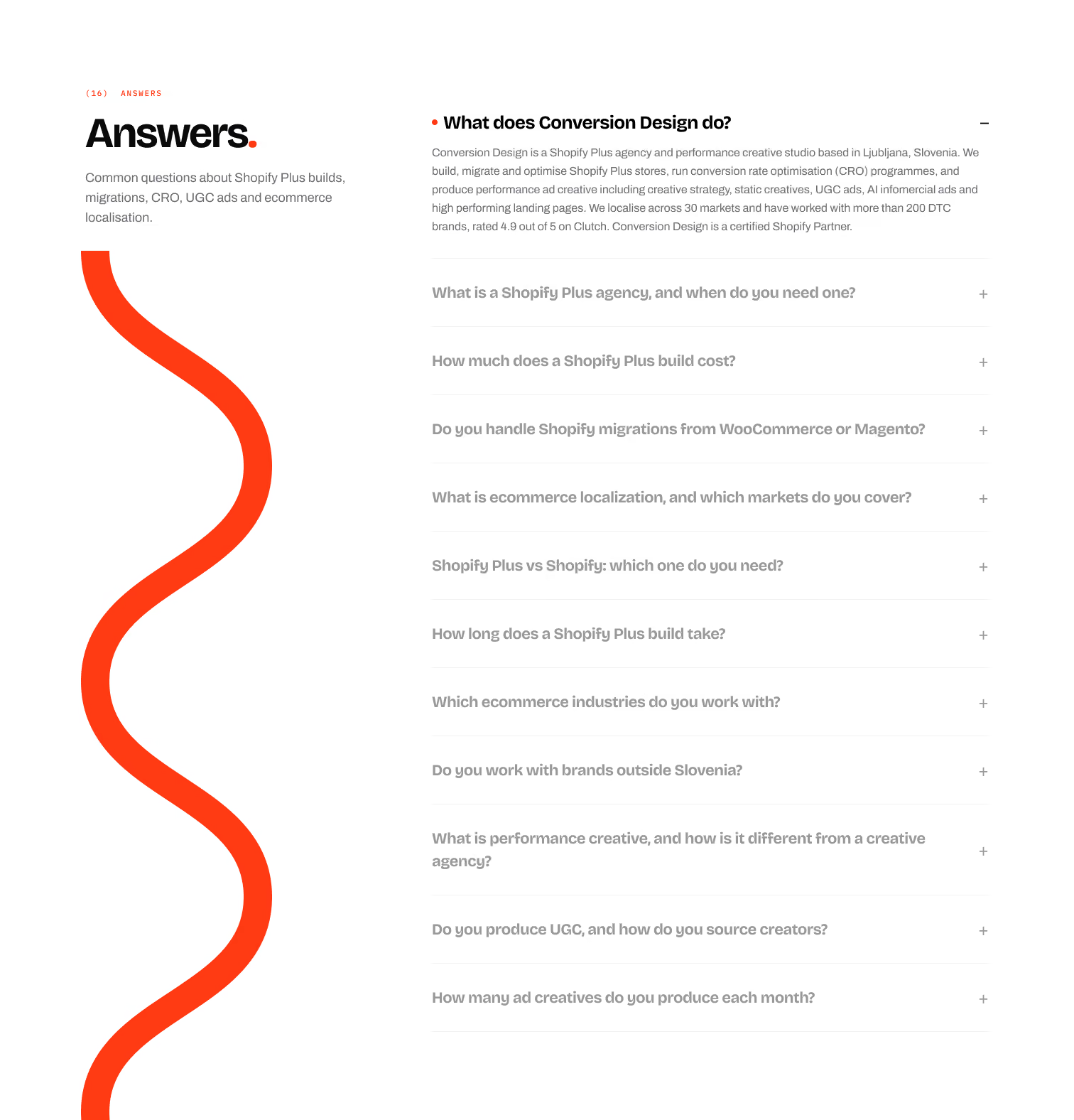
What if i have more question?

The FAQ section provides additional context for visitors who need more information before making a decision. A two-column structure separates the visual element from the information architecture, allowing a large amount of content to remain organized and accessible.
CTA

How can i proceed?

The final CTA distills the entire experience into one clear next step: show us your store and your ads. By placing the conversion point after the proposition, proof and objection handling, the CTA feels like the natural conclusion of the journey rather than an interruption.The footer then reinforces the site's information architecture while the oversized wordmark provides a strong visual close.
Visual Language

the design approach

The visual direction was built around a high-contrast editorial aesthetic that balances the credibility of a professional agency with a more expressive creative personality. A restrained black, white and orange palette creates a strong foundation, while oversized typography, custom graphics and generous spacing give the interface a distinctive character.
Typography

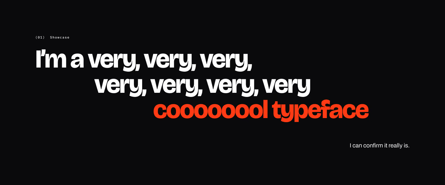
Special Bold typeface

Large, tightly controlled headlines create hierarchy and give the website a strong editorial presence. Orange is used selectively to emphasize important words, concepts and CTAs rather than becoming a dominant brand color.
Contrast

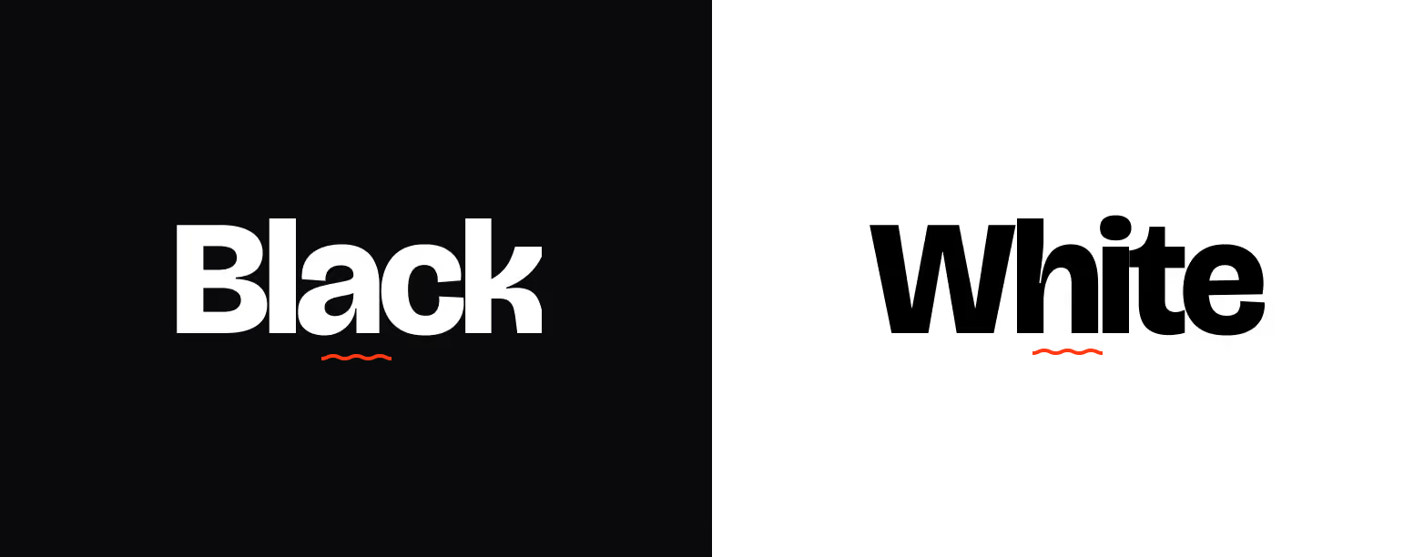
Black and White

The alternating light and dark sections create rhythm throughout the page. White sections provide clarity for information-heavy content, while darker sections are used for stronger statements, creative work and social proof.
Graphic language

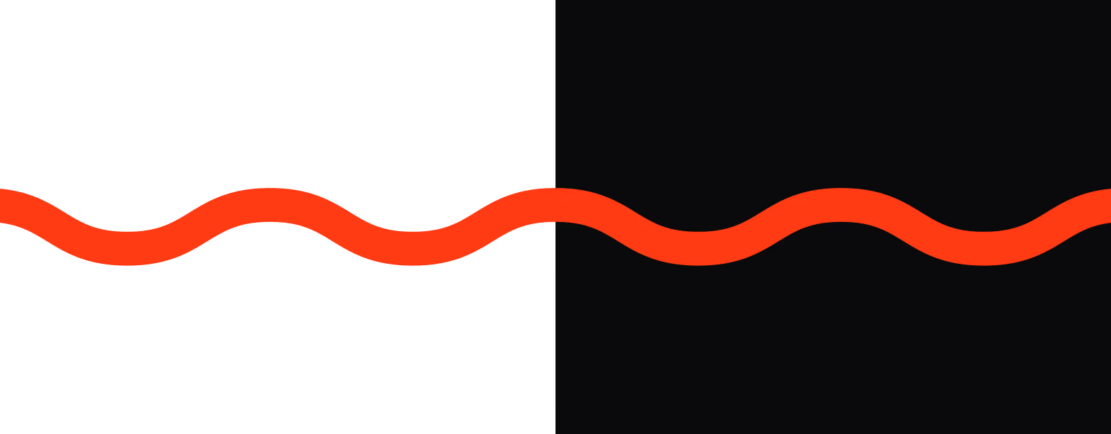
The Orange within

The orange wave became a recurring visual element across the site. Combined with custom illustrations and photography, it gives the otherwise structured interface a more recognizable visual identity.
Web solutions

Unified Design language

The same design direction was extended beyond the main Conversion Design website to create a consistent ecosystem across the company's digital properties.
While each site serves a different purpose and audience, they share the same underlying principles: typography, spacing, interaction patterns, component structure and visual hierarchy. This creates familiarity between products without forcing every experience into the exact same visual layout.
The system was designed to be flexible enough to support different content structures, conversion goals and levels of information density, while still making each site feel like part of the same brand.
Contact Me

Have I Peaked you're interest?

My journey into the world of design began in elementary school when I discovered Cinema 4D and After Effects, which I used to create text animations. The positive feedback