UI/UX Design

Adward Conversion optimized Website Design

I designed the website for Adward, an AI-powered creative platform built for European marketing teams. The goal was to create a website that could communicate a complex product quickly while creating a strong path toward conversion.
SaaS Website
Increased Conversion Rate
Made in 12 hours
The challenge

Designing the Experience

Adward brings multiple capabilities together AI creative generation, localization, resizing, and campaign workflows. The website therefore had to communicate a lot of information without making the product feel complicated.

The main goal was to create a website that could explain the product quickly, build trust, and guide visitors toward conversion.

I approached the website as both a product story and a sales tool. Every section needed to answer a specific question, demonstrate value, or move the visitor closer to understanding why Adward could be useful to them.
Website Logic

The Home Page Flow

The website follows a deliberate journey moving visitors from understanding the product to trusting its value and ultimately taking action.
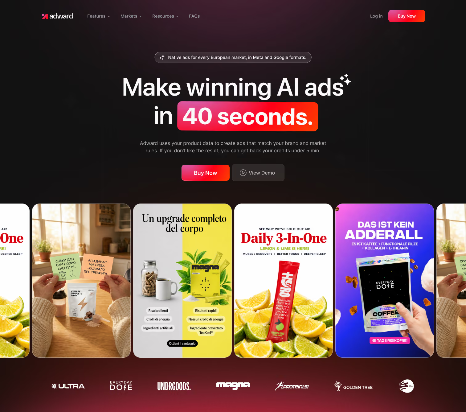
Hero Section

What is Adward?

The hero communicates the core value proposition immediately, supported by real creative examples that make the product tangible from the first interaction.
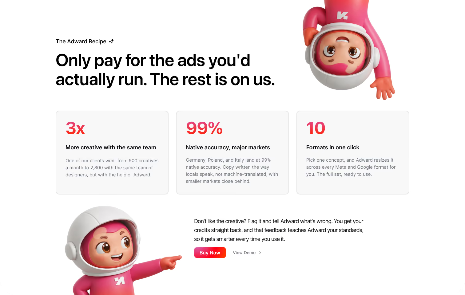
Value Proposition

Why should I care?

Key benefits and performance statistics quickly reinforce the value of the platform, giving visitors a reason to continue exploring.
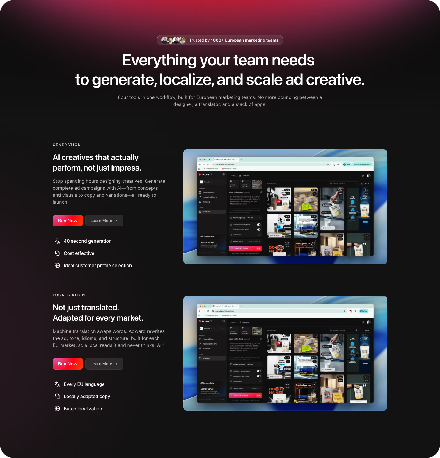
Capabilities

What can it do?

The experience moves into Adward's core capabilities — generation, localization, and resizing — using product visuals alongside concise explanations to make each feature easy to understand.
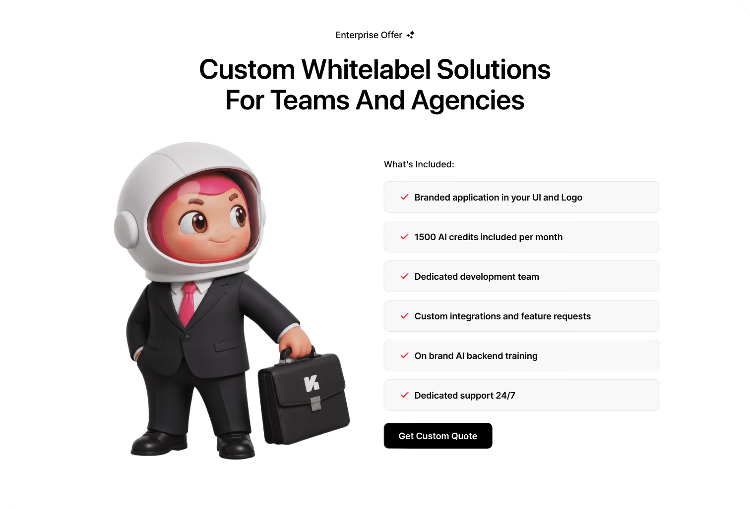
Enterprise solution

Can it work for my organization?

The Enterprise section introduces a more advanced use case for larger teams, highlighting white-label capabilities, flexibility, and the ability to integrate Adward into a broader marketing workflow.
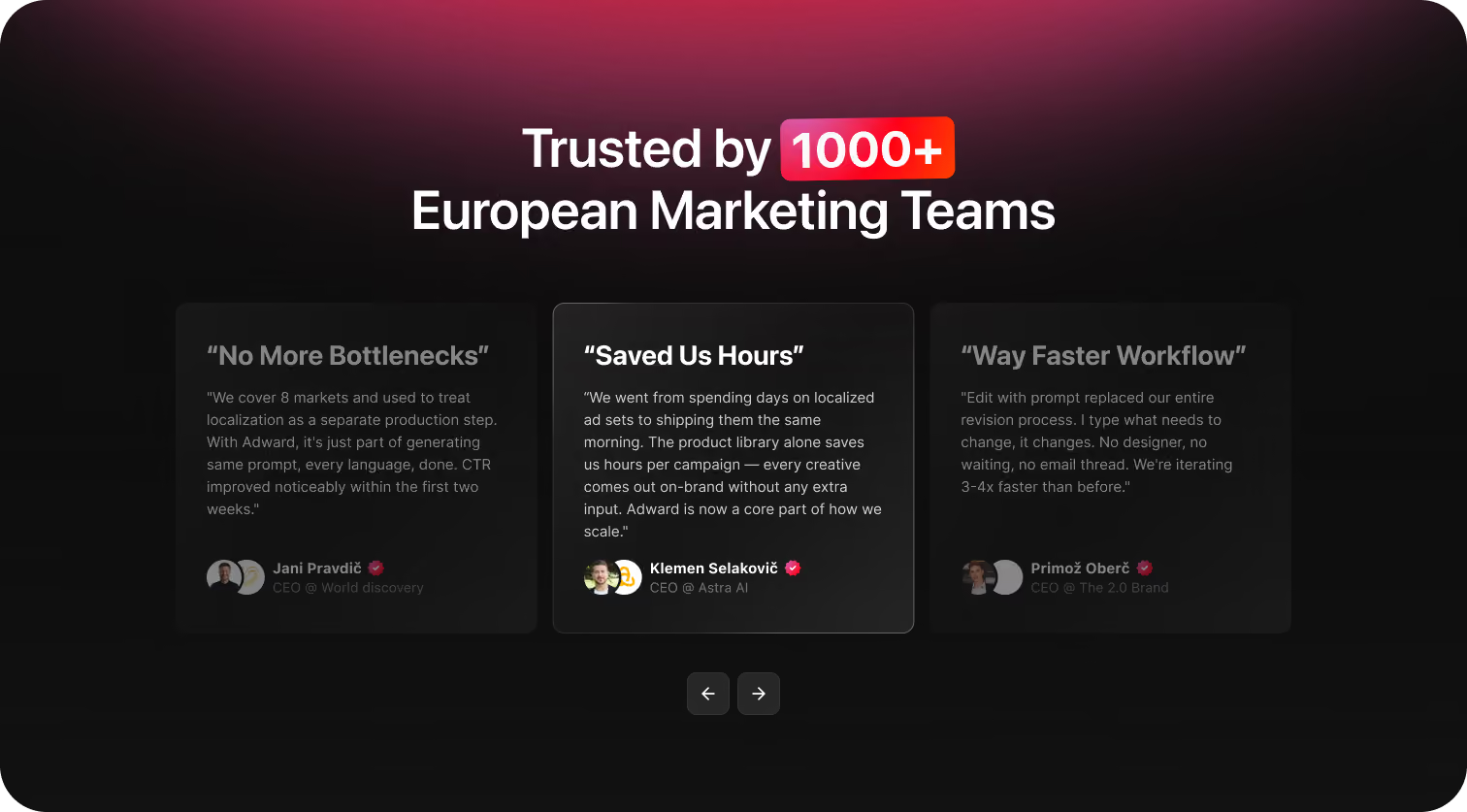
Trust section

Why should I believe it?

Customer logos, testimonials, results, and product examples introduce social proof throughout the journey, reducing uncertainty without interrupting the flow.
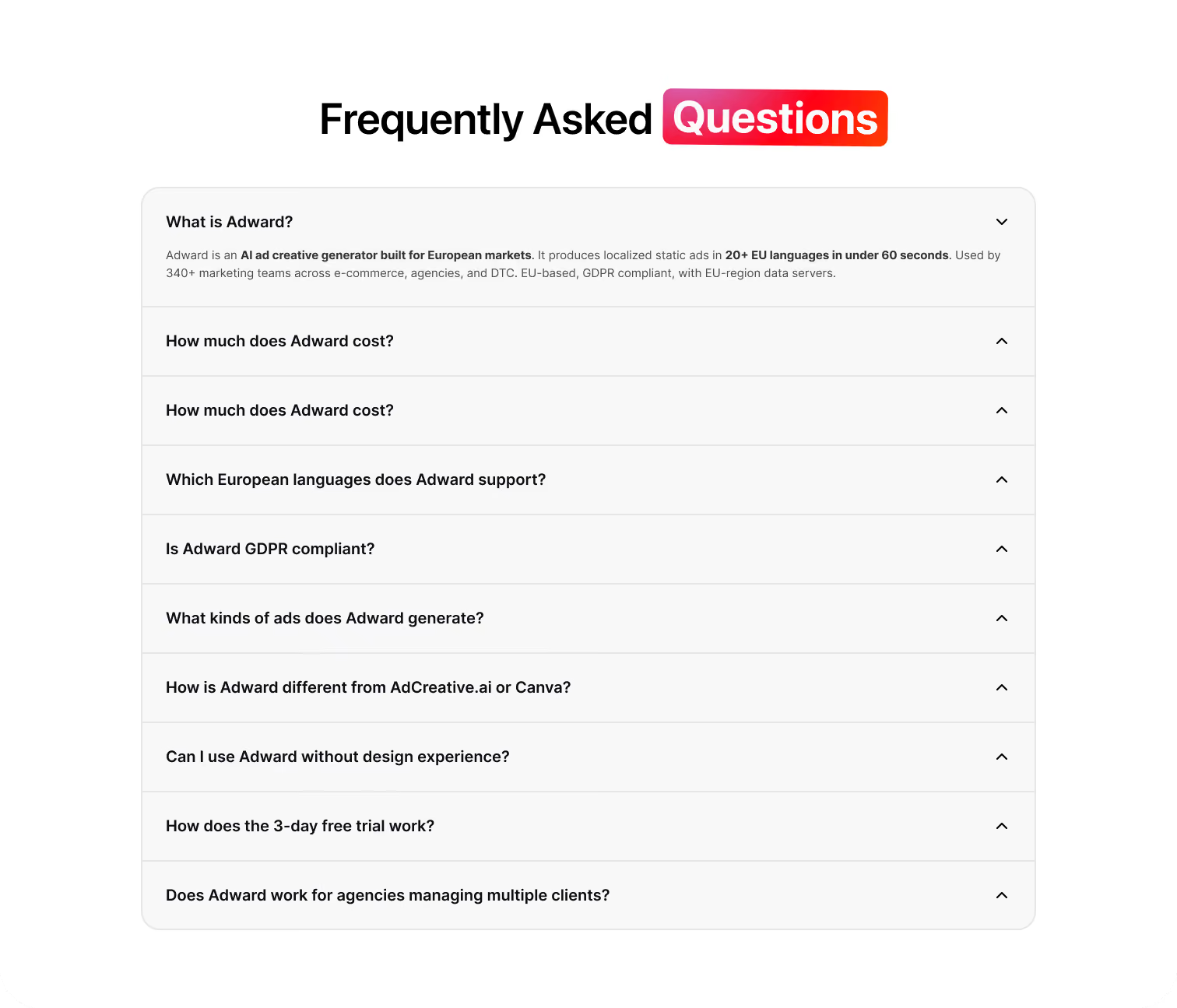
FAQ

What if I still have questions?

The FAQ section addresses common questions and potential objections before the final decision, giving visitors the information they need without forcing them to leave the main experience.
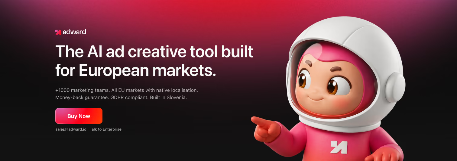
CTA section

What's my next step?

Clear calls to action appear throughout the experience, giving visitors multiple opportunities to start using Adward once they have enough information to make a decision.
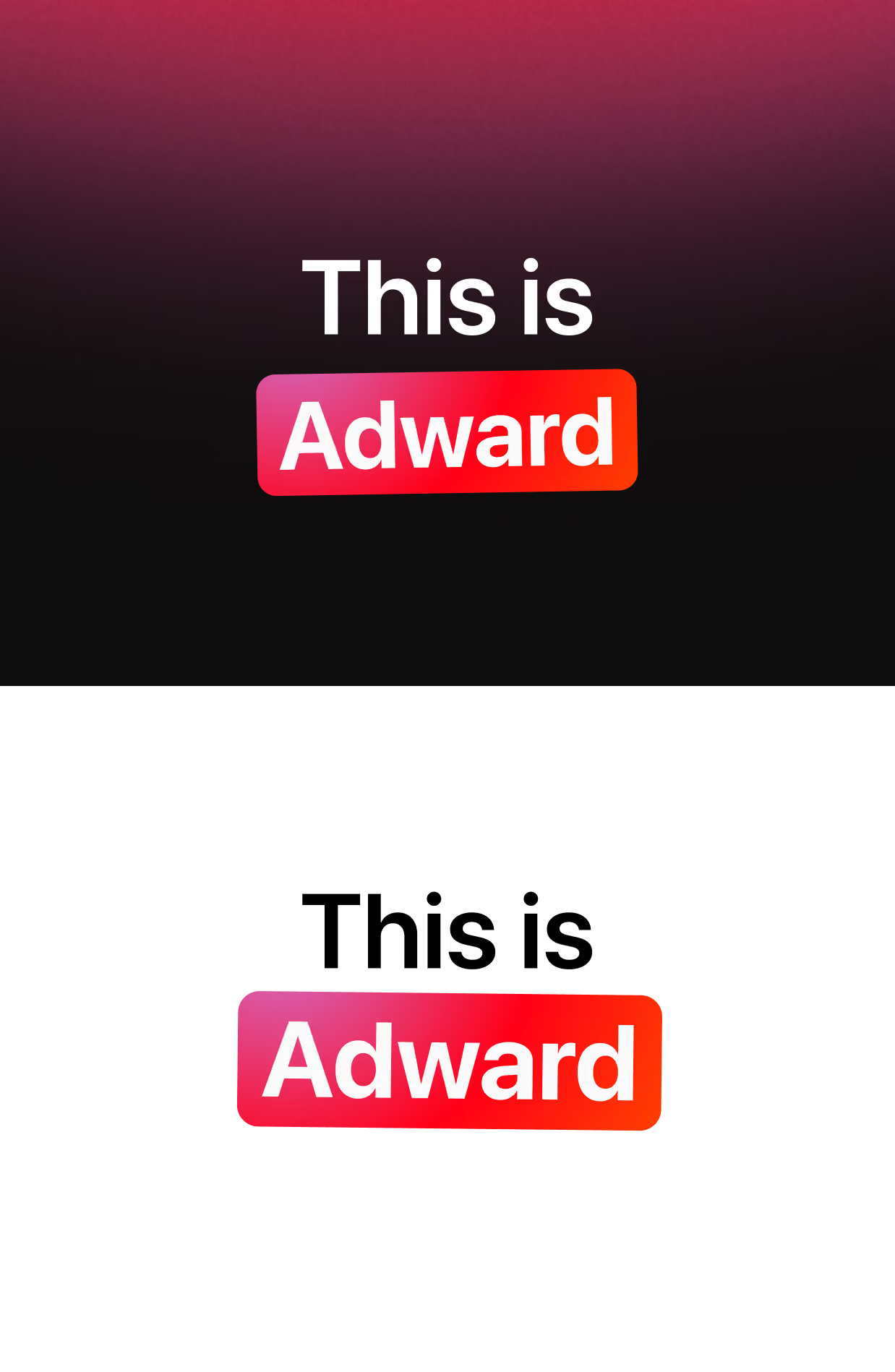
Two-tone

Dark & Light

The contrast between dark and light sections became one of the defining characteristics of the visual system.

I used darker sections to create stronger visual moments and give product demonstrations, gradients, and illustrations more impact. Lighter sections were used when the content required more focus and readability.

This contrast also created a natural rhythm throughout the page. Instead of every section competing for attention, the alternation between visual intensity and quieter areas allowed important moments to stand out.

The pink-to-red gradient acts as a connecting element between these two environments, helping the different sections still feel like part of one cohesive experience.
The Key element

The Mascot

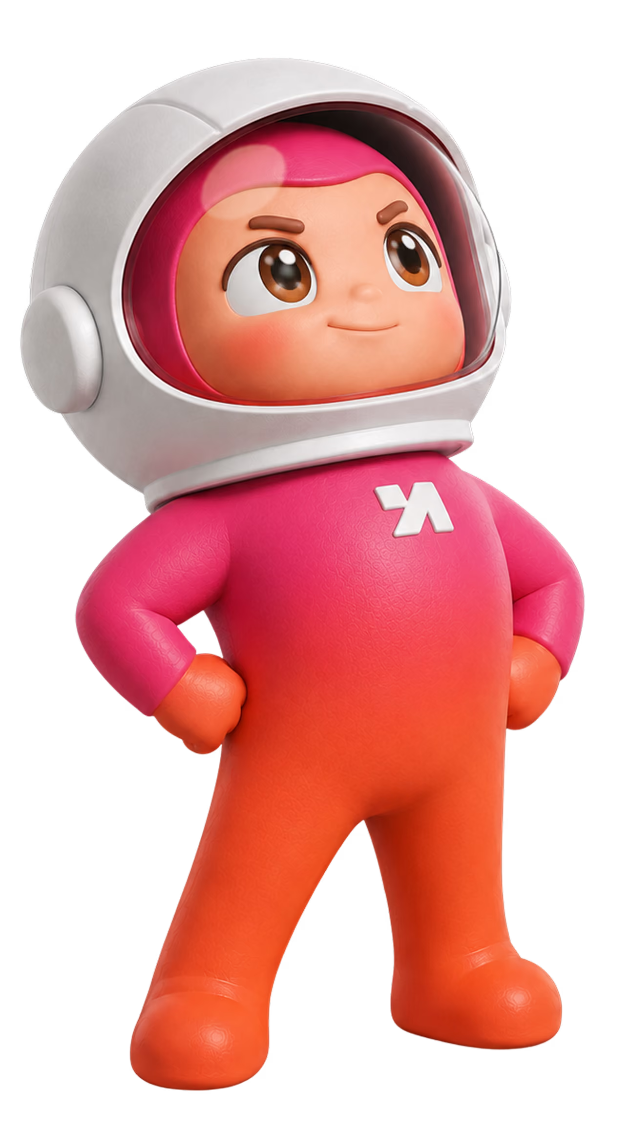
A central part of the visual direction was the Adward mascot.

Rather than treating the character as a standalone illustration, I integrated it into the overall experience as a recurring visual element. It gives the brand a recognizable personality and creates visual continuity between otherwise very different sections.

The mascot also helped solve a practical design problem: SaaS websites can quickly become visually repetitive when they rely heavily on screenshots, cards, and text. The character creates moments of visual contrast and helps break up information-heavy areas without distracting from the content.

I adapted the mascot's placement, scale, and context throughout the website so that it could support the message of each section while remaining visually consistent.
Web solutions

Adapting the System

The design wasn't created only for the homepage. I also designed the supporting pages and adapted the visual system to different types of content and purposes.
Product pages, market-specific pages, comparisons, FAQs, blog content, and other supporting experiences all required different structures, but they were built from the same underlying principles.
This meant maintaining consistency without simply repeating the same layouts everywhere. The system provided a common visual foundation while allowing each page to have its own hierarchy and purpose.
The outcome

Key Takeaways

This project strengthened my approach to designing SaaS websites as complete experiences rather than collections of individual pages.

The biggest challenge was balancing complexity with clarity. Adward has a lot to communicate, but the website needed to make the product feel simple, approachable, and valuable from the first interaction.

The final design combines a distinctive visual identity with a structured user flow, using contrast, typography, imagery, the mascot, and reusable components to guide the visitor through the story of the product.

Most importantly, the project gave me experience adapting one design system across different pages and purposes while keeping the overall experience cohesive.

The result is a website that doesn't just present Adward — it communicates what the product is, why it matters, and why a visitor should take the next step.
Contact Me

Have I Peaked you're interest?

My journey into the world of design began in elementary school when I discovered Cinema 4D and After Effects, which I used to create text animations. The positive feedback